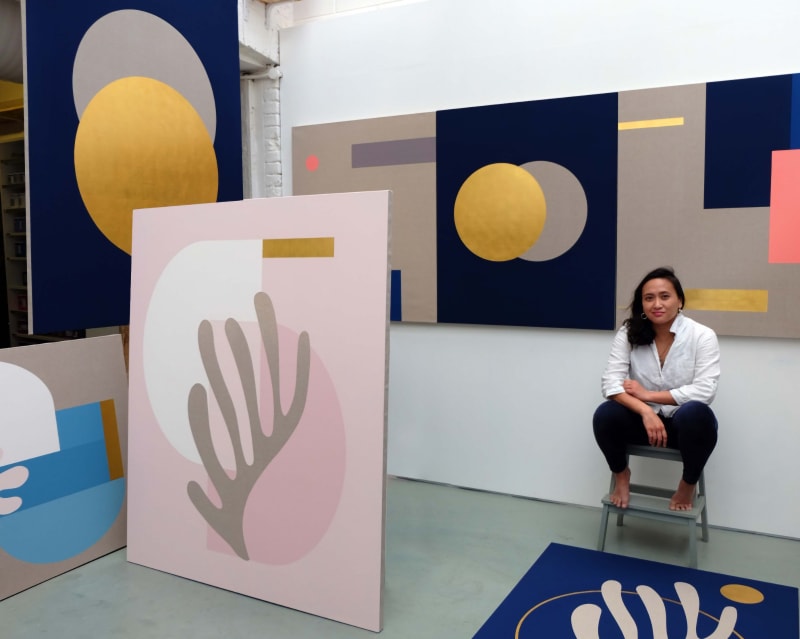
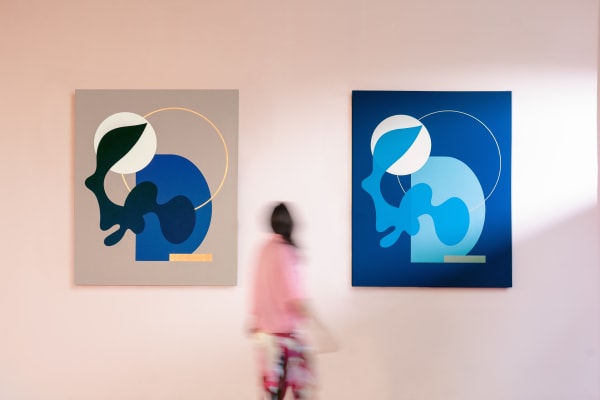
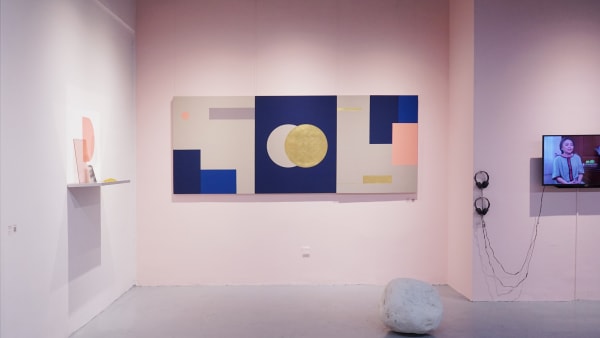
The existence of art can be traced back to thousands of years ago and it’s still evolving until now. However, regardless of what form or timeline the art was created, they all have the same thing in common: naturally radiating the beauty and aesthetic of its surroundings. This is particularly true to Sinta Tantra, a British artist of Balinese descent. Her artworks are focused on the surroundings, where both the artwork and its surrounding space are able to create harmony, enhancing the beauty of both while at the same time delivering the history and the message behind the works.
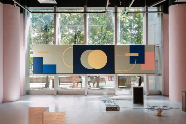
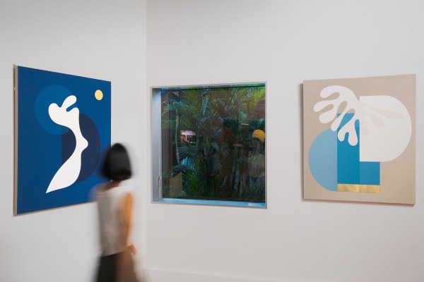
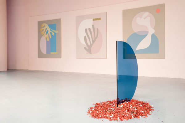
Her artworks are known internationally for the way she played with colours, forms, and geometry; shapes and lines that are beautifully integrated to create a meaningful piece of art. According to Tantra, colour is very essential to her practice as it serves as a bridge between the language of art and industry. The combination of abstraction and modernism allow the audience to engage and create their own narratives that might vary at different times of the day. Although she has been known for the use of geometric shapes and lines, she once had to face the stereotype of being an Asian woman where she was expected to create ‘something cute and feminine, in small sizes’. This experience motivated her more to create abstract and structured paintings.
The inspiration behind her artworks comes not merely from the stereotype that she faced, but her background and the cultural differences that she experienced from having to move around Indonesia, USA, and the United Kingdom also contribute to the artworks. The bright/ pop-tropical colours that she often used in the paintings were inspired by the culture and environment of Bali, as well as 1980s American pop. She is more interested in public arts as it allows her to create works that intersect with the architectural space and not be confined by the canvas. Since her artworks often amplify the functionality of the surrounding buildings, it’s often seen that the two-dimensional artworks are interacting harmoniously with the three-dimensional environment, both being decorative and functional, public and yet private.
Her interest in artworks that could play with the architectural space began when she took a postgraduate degree at Royal Academy of Arts in 2006. For her, public arts will give her the opportunity to create artworks that would be in resonance with the space by injecting colour, line, and form. Additionally, public art is also important because she believes the artworks could teach people to appreciate art, and learn the importance of expressing one’s thoughts and feelings. She states, “Art makes us feel human. We need a poetic touch in life, a room for creativity. My work in public can give inspiration to other people, creative and independent.”
Her art practice has been known internationally from her artworks that are displayed around the world, such as Indonesia, China, Berlin, London, among others. One of her most recent works earlier this year is called ‘Illuminated’. It’s a mural located at 22 Bishops Gate, a commercial skyscraper in London. The historical and contemporary approach became the inspiration for the mural: the history of London during the medieval period being connected to the bustling life of London nowadays. As opposed to the bright colour that she often used, she injected a more ‘masculine’ colour palette in this mural; subdued blues, blacks, and neutral tones fill solid geometric forms. She also adds dark, gold lines to present the medieval materiality. The composition of geometric forms creates the sense of harmony and balance in the midst of London’s busy life.
She also created a mural in South Korea called ‘Pink Moon Rising’ this year. This mural is in collaboration with Seolhaewon Clubhouse located in Yangyang, Gangwon-Do. Through this mural, she wanted to bring the landscape into the clubhouse’s inside space, which is the resort. The use of gold leaf in the mural symbolises universal beauty that would make people take a moment to stop and look. The geometrical shapes in the mural are all incorporated to depict the nature surrounding the resort; sun, moon, stars, mountains, hills, forests, and lakes. The bright pink circle in the upper right corner symbolises apink moon, an idea of something sublime within nature.
The mural challenged audience to reimagine the relationship between nature and the universe, inviting people to stop for a moment from their busy life, to connect with nature and to themselves physically, mentally, and spiritually by creating a sense of peace and tranquility, aligned with the goal of the resort that is to give a complete rest.
She has an upcoming solo exhibition later this year with ISA Art and Design curated by Sadiah Boonstra, titled Constellations of Being. She had done successful exhibitions with ISA Art and Design last year, Spaces and Buah Tangan.
 Sinta Tantra, Constellations of Being I, 2022
 Sinta Tantra, Constellations of Being II, 2022
 Sinta Tantra, Constellations of Being III, 2022
 Sinta Tantra, Dong Luh, (She Stopped Telling Me, And I Stopped Crying) , 2022
 Sinta Tantra, Harsiam (Broken Eggs), 2022
 Sinta Tantra, Indah Ripon (Black Magic), 2022
 Sinta Tantra, Mukri (Combing My Hair By the River), 2022
 Sinta Tantra, Remben (Purusa), 2022
 Sinta Tantra, Taman Ujung (A Water Palace) , 2022
 Sinta Tantra, Taksu (A Reincarnation), 2022
 Sinta Tantra, Two Cousins (Batu Bata), 2022